Microsoft Word Auto-Complete: Get Your Hands Off of My Writing
So anyway, I was writing something for a job application, and I began a new line by writing,
Take
as in, "Take a moment to something something something." But this is what Microsoft Word's Auto-Complete suggested for me:
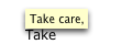
....
AS IF I NEEDED HELP TO THINK OF "TAKE CARE." THANKS A LOT, MICROSOFT. I mean, first of all, how many times when you write "take" is it because you are going to write "take care?" Maybe once out of every 100 times? 200? Even if we're talking about the times that you begin a new line with "Take," it can't be better than one out of 10, can it?
And let's just say, for the sake of argument, that I had been meaning to write "Take care." It just makes me feel slimy to think that my computer is giving me little hints on what heartfelt things I can say to end my letter.
Auto-complete is probably Word's most hated feature. Because, most of the time, it changes something from how we intend it to something entirely different. And even when it does guess right, the user is usually surprised, and spends a few seconds trying to figure out what just happened, thus losing the 0.5 seconds that would have been saved by auto-completing words like "care." And in the worst-case scenario, it will make changes (numbered lists, I am looking in your direction) that the user then has to battle for ten minutes to get them to look how he wants them to look rather then what Word decides the user must have intended.
Take
as in, "Take a moment to something something something." But this is what Microsoft Word's Auto-Complete suggested for me:
....
AS IF I NEEDED HELP TO THINK OF "TAKE CARE." THANKS A LOT, MICROSOFT. I mean, first of all, how many times when you write "take" is it because you are going to write "take care?" Maybe once out of every 100 times? 200? Even if we're talking about the times that you begin a new line with "Take," it can't be better than one out of 10, can it?
And let's just say, for the sake of argument, that I had been meaning to write "Take care." It just makes me feel slimy to think that my computer is giving me little hints on what heartfelt things I can say to end my letter.
Auto-complete is probably Word's most hated feature. Because, most of the time, it changes something from how we intend it to something entirely different. And even when it does guess right, the user is usually surprised, and spends a few seconds trying to figure out what just happened, thus losing the 0.5 seconds that would have been saved by auto-completing words like "care." And in the worst-case scenario, it will make changes (numbered lists, I am looking in your direction) that the user then has to battle for ten minutes to get them to look how he wants them to look rather then what Word decides the user must have intended.
posted by Dave at 11:03 AM
0 comments
![]()